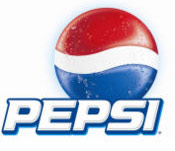
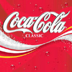
The current Coke and Pepsi logos use very different colours, fonts, and imagery to capture our attention.
  |
What is interesting is that the look of these two logos was not always so different.
  |
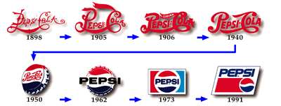
They look similiar, don’t they? Both Coca Cola and Pepsi Cola originally used decorative red script with long flowing banners extending from certain letters to describe their brand.
Also notice how Coca Cola’s script, taken from an 1899 advertisiment, is quite similiar to the current script, whereas Pepsi’s early logo is completely different from the one it uses now.
  |
Over this time frame, Pepsi had begun to simplify the script in its logo. Gone is the ornate A, for instance. Coca Cola had begun to formalize their script with a few small changes, including the shortened tail of the first C.
  |
In its new logo, Pepsi dropped the “drink” and “delicious” from the P and C. Blue was introduced as a colour. Coca Cola removed the words “trademark registered” from the tail of the C and listed “Reg. US Pat Off.” below. The C’s tail shrunk to today’s size.
It was in the next two decades that Pepsi’s logo would dramatically change.
 |
In the 1950’s, the “epsi” and “ola” were no longer written decoratively, but in plain text. The double hyphen was replaced by a single hyphen, and the P and C lost their dramatic decoration. This lasted till the early 1960s |
| A second logo used in the 1950s and early ’60s completely abandoned script for a serif font. Yikes. Also introduced were lower-case letters. |  |
 |
This logo introduced around 1962 used a sans-serif font for the first time. |
| From here it was a short skip and a jump to this logo, which integrated the bottle cap look, the blue and red colour format, and the plan sans-serif text. This came out in the late ’60s and early ’70s. | 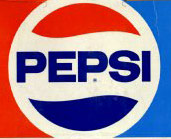 |
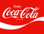 |
While all this was happening, Coca Cola introduced one small change, and this not till 1969: the wave. Coke’s classic text stayed unscathed. |
  |
In 1991, Pepsi updated its logo by adopting a new high-techish font, italicizing it, and moving it out of the bottle cap image. In the early 1980s, Coke updated its logo by moving the wave up and into the text. To see the newest logos, scroll to the top of this post.
Through this entire evolution, Coca Cola’s text has stayed constant and unchanged, preserving the same look it had in the 1800s. Updates have been cursory and cosmetic. Pepsi, on the other hand, has evolved multiple times; from fancy script, to plain script, to serif print, to lower case, to sans-serif, and italics.
At certain points in their history, each logo incorporated a new image - Pepsi the bottle cap, and Coke the wave. But Coca Cola’s text has stayed central to the company’s image, whereas Pepsi has ventured inside the bottle cap, to the top of it, and below it.
What this shows is that Pepsi has tried to be ‘new’ to each generation that consumes its product, whereas Coke has been content to stay loyal to its classic origins. We all know this from the marketing slogans, but this is way to see the same thing in a visual way.
